Stacked Horizontal vs Vertical Subway Tile: Modern Design Comparison
Choosing between a stacked horizontal vs vertical subway tile layout significantly influences the architectural character of your home. While the classic brick-bond pattern remains a staple, modern design increasingly favors the clean, geometric precision of stacked arrangements. These layouts offer a refined aesthetic that strips away the traditional feel of subway tiles to highlight their form and color.
By understanding how these orientations manipulate visual perception, you can make an informed decision that enhances your specific space. This comparison explores the technical and stylistic implications of each choice, ensuring your next renovation project aligns perfectly with your vision for a modern, cohesive interior.
Understanding the Stacked Tile Aesthetic
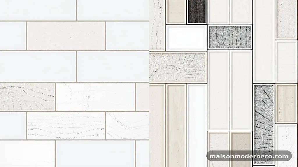
The stacked tile layout, often called a grid pattern, involves aligning tiles directly on top of each other rather than offsetting them. This approach creates a clean, intentional grid that emphasizes the grout lines as a primary design element.
When you move away from the traditional running bond, you stop focusing on the individual units and start seeing the wall as a singular, structured plane. This is why many designers prefer this method for contemporary kitchens and bathrooms.
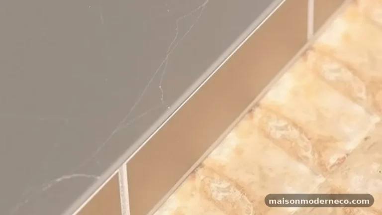
In a stacked configuration, the intersection of grout lines forms a perfect cross. Achieving this requires high-precision installation, as any slight variation in tile size or alignment becomes immediately apparent to the eye.
Because there is no offset to hide minor discrepancies, the quality of the ceramic or porcelain product you select matters immensely. Rectified tiles, which are cut to exact dimensions, are highly recommended for this specific style to ensure the grid remains crisp and uniform across the entire surface.
The Impact of Horizontal Stacking
A horizontal stacked subway tile layout provides a grounded, stable feeling to a room. By emphasizing the width of the wall, this orientation helps to make narrow spaces feel slightly more expansive. It draws the eye from side to side, which is particularly effective in smaller bathrooms where you want to maximize the sense of floor-to-ceiling volume without feeling cramped.
This layout works exceptionally well in kitchens that feature long, linear runs of cabinetry. When the grout lines align with the horizontal plane of the countertops, the result is a harmonious, balanced look that feels intentional and calm.
It is a subtle way to incorporate texture without overwhelming the visual field. If you are aiming for a minimalist kitchen, horizontal stacking offers a sophisticated backdrop that complements handle-less cabinets and integrated appliances.
Leveraging Vertical Stacking for Height
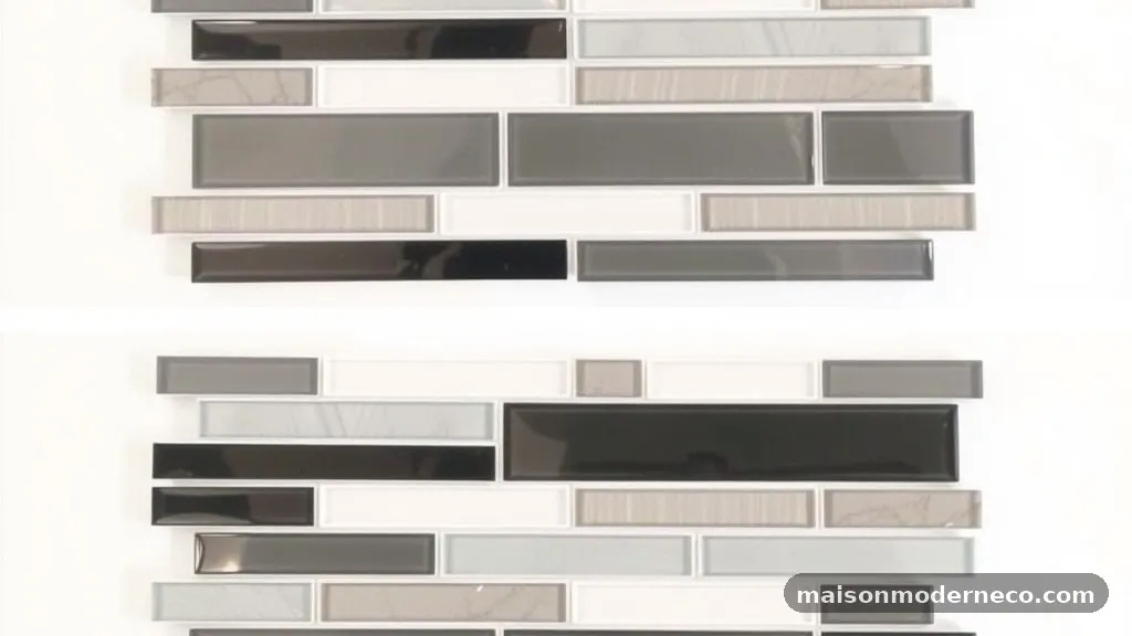
Vertical stacking is a powerful tool for manipulating the perceived dimensions of a room. By aligning subway tiles vertically, you force the eye upward, which creates the illusion of taller ceilings.
This is a brilliant strategy for powder rooms or shower enclosures where the ceiling might feel low or the footprint is limited. The vertical lines break up the horizontal monotony of standard furniture and fixtures, adding a dynamic, architectural element to the walls.
Beyond the height advantage, vertical orientation creates a sense of elegance and luxury. It feels less utilitarian than standard brick-bond patterns and more like a high-end design choice.
When used in a shower, vertical tiles can draw attention to the height of the enclosure, making the space feel more like a spa-like retreat. Just ensure that your installer is comfortable with this layout, as maintaining perfectly plumb vertical lines is essential to the success of the finished project.
Selecting the Right Grout Color
The relationship between your tile and your grout is arguably the most critical factor in a stacked design. Because the stacked layout highlights the grid, the contrast between the tile body and the grout color will define the final look.
If you choose a high-contrast grout, such as dark charcoal lines against white tiles, you are essentially creating a graphic pattern on your wall. This can become a focal point of the entire room.
Conversely, choosing a matching grout color creates a more subtle, monolithic appearance. This approach is often referred to as a guide to professional tile installation, where the focus remains on the texture and finish of the tile surface itself.
This choice is ideal for smaller spaces where you want to avoid visual clutter. Before finalizing your decision, always perform a sample board test with your chosen grout color, as it will look different once it has dried and cured between the tiles.
Comparing Installation Complexity
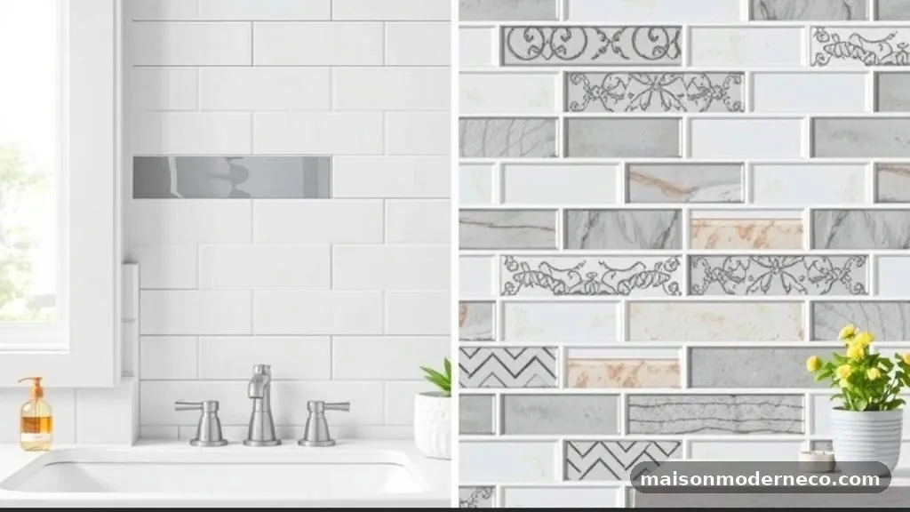
While both horizontal and vertical stacked layouts look simple, they are technically more demanding than traditional patterns. The lack of an offset means that if your walls are not perfectly plumb or level, the error will be magnified.
A professional installer must take extra care to ensure that the grid remains consistent from the first tile to the last. This often involves more frequent use of leveling systems and spacers to maintain exact gaps.
Horizontal layouts can be slightly more forgiving if your subfloor or countertop is perfectly level, as you have a clear starting point. Vertical layouts require a perfectly plumb reference line to ensure the tiles don’t “drift” as they move up the wall.
If you are tackling this as a DIY project, be prepared for a slower pace. You will spend more time measuring and checking your work than you would with a standard running bond pattern.
Creating Feature Walls with Tile Orientation
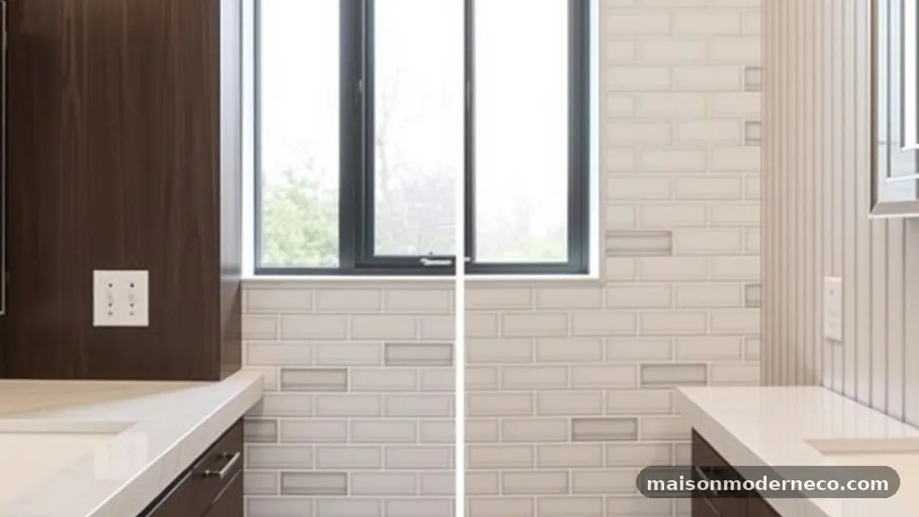
One of the most effective ways to use tile orientation is to define a specific zone within a larger area. For instance, you might use horizontal stacked tiles for the main backsplash area, but switch to vertical stacking inside a recessed shower niche or behind a vanity mirror. This contrast creates visual interest and helps to zone the space without the need for physical barriers or changes in color.
You can also use orientation to draw attention to specific architectural features. If you have an arched doorway or a unique window, framing it with vertically stacked tiles can accentuate the shape. This technique effectively turns a functional wall into a decorative element.
When mixing orientations, keep the tile size and color consistent to ensure the transition feels intentional rather than accidental. This creates a cohesive narrative throughout the home, especially when carrying the same tile style from the kitchen into the bathroom.
The Role of Lighting and Reflectivity
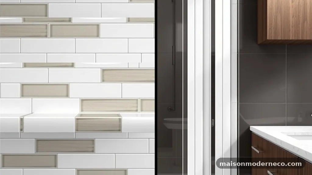
Lighting plays a crucial role in how a stacked tile layout is perceived. Glossy subway tiles, when stacked, reflect light in a very structured way due to the uniform grid.
In a horizontal layout, the light will catch the horizontal grout lines, creating long, thin highlights that emphasize the length of the wall. In a vertical layout, the light creates vertical streaks, which can make a wall feel more dramatic and monolithic.
Consider the placement of your lighting fixtures in relation to the tiles. Wall sconces placed over a vertically stacked backsplash will cast shadows that highlight the verticality of the pattern.
Similarly, under-cabinet lighting in a kitchen will illuminate the horizontal grid, adding depth to the backsplash. If you want to highlight the texture of handmade or zellige-style tiles, the way light plays across the stacked surface is an important factor to consider during the planning phase.
Managing Small Spaces Effectively
When dealing with compact bathrooms or kitchens, the choice of orientation can be a game-changer for the feel of the room. A common mistake in small spaces is choosing a layout that makes the area feel boxed in.
While horizontal tiles can widen a narrow room, they can also make it feel shorter if the ceiling is low. Vertical tiles can solve this by creating a sense of elevation, making the room feel airier and more open.
Avoid using very large-format subway tiles in extremely small spaces, as they can overwhelm the proportions. Stick to classic 3×6 or 2×8 dimensions for a more balanced look.
Regardless of the orientation, keeping the grout color close to the tile color will help the walls recede, which is a classic design trick to make a small room feel larger. By focusing on the layout, you can effectively trick the eye into perceiving more space than is actually present.
Common Mistakes to Avoid
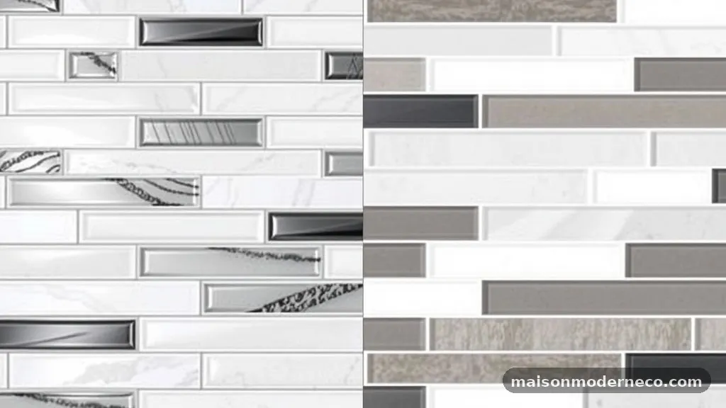
The most frequent error when attempting a stacked layout is failing to account for wall irregularities. If your walls are not perfectly square, the grid will eventually become crooked. Always check the corners of your room with a level before starting.
Another common mistake is ignoring the end-of-wall cuts. A stacked layout requires careful planning of where the tiles will terminate at the corners; an uneven sliver of tile at the edge of a wall can ruin the clean look of the entire grid.
Another pitfall is selecting the wrong tile type. Hand-pressed or irregular tiles, while beautiful, are very difficult to stack in a perfect grid because their edges are not uniform. If you want the sharp, modern look of a stacked layout, choose machine-pressed or rectified tiles.
Finally, don’t underestimate the importance of the grout joint width. A wider joint will make the grid pattern much more prominent, which might be exactly what you want, or it might be too overwhelming for your space.
Frequently Asked Questions
Is stacked subway tile more difficult to install than traditional brick-bond?
Yes, it is generally considered more difficult. Because there is no offset to hide minor variations in tile size or wall alignment, every single tile must be perfectly placed. Any deviation from the grid is immediately visible, requiring more time, precision, and the use of professional-grade leveling clips.
Should I choose vertical or horizontal for a small bathroom shower?
If your goal is to make the shower feel taller, vertical stacking is the superior choice. It draws the eye upward and emphasizes height. If your shower feels narrow and you want to make it feel wider, horizontal stacking is more effective at expanding the visual width of the space.
Is the stacked tile look going out of style in 2026?
The stacked layout is currently considered a timeless, modern classic rather than a fleeting trend. While the traditional running bond is always popular, the clean, minimalist appeal of the stacked grid has become a staple in contemporary interior design, particularly for those who prefer a structured, organized aesthetic.
Can I mix vertical and horizontal layouts in the same room?
Yes, mixing orientations can create a sophisticated, high-end look. Many designers use vertical tiles for a focal area, like a shower wall or a niche, and horizontal tiles for the remainder of the room. The key is to keep the tile color and size consistent so the transition between patterns feels deliberate.
Does grout color affect the perceived size of the room?
Absolutely. High-contrast grout emphasizes the pattern, which can make a space feel busier and more active. If you want to make a small space feel larger, a matching or low-contrast grout is best, as it allows the eye to travel across the wall without being interrupted by a heavy grid of lines.
Achieving Your Design Vision
Whether you opt for the grounding influence of horizontal lines or the elevating effect of a vertical arrangement, your choice of tile orientation is a fundamental element of your home’s character. A stacked horizontal vs vertical subway tile decision should be guided by your specific goals for the room’s proportions and your personal aesthetic preferences. By prioritizing high-quality materials and precise installation, you ensure that the final result is not only functional but also visually striking.
Take the time to mock up your patterns on a board before committing to the full installation, as this allows you to see how the light and grout interact in your specific environment. Your commitment to detail during this phase will pay off in a polished, modern space that reflects your unique style and vision.